Do you love vintage-looking photography with those soft colors and yellow-blue-red tints? Good. Do you like to take pictures? Good. Today I'm starting the first of a three part series on how to get the above look, or similar, with your photos with different kinds of techniques and photo-editing software. Now don't fear, I have researched free tools and websites that will allow you to get very close, if not better, than the image above I have produced with Photoshop.
I have been doing this for years and years to my photos, I've always been obsessed with color and have experimented with different ways to tweak my photos to evoke the mood I want to create. It's very easy to do and it creates a beautiful result!
Before we begin I want to include a list of editing software and free tools available to you.
Software:
Adobe PhotoshopCS5 - this is what I use
Adobe Lightroom - this is what I use
Adobe Photoshop Elements - your best bet for using Photoshop without all of the bells and whistles, and for a fraction of the cost
Pixelmator - Most affordable
Corel Paint Shop Pro - I used to use this
Free Tools:
Photobucket - New and improved editing features
Pixlr - Very similar to Photoshop and should be able to follow the tutorial closely
Picnik - Easy to use
Photoscape -
Paint.NET - Very similar to Photoshop and should be able to follow the tutorial closely
Picasa - Google's photo editing tool
Vintage Effects: Part 1, Color Balance and Solid Color Layers
For this tutorial I will be using Photoshop, but do not worry - I will include examples below each section for how you can create these effects if you don't own Photoshop.
***Important***: Every image is different! There are different colors, different lighting, and different subjects. Because of this I do not use exact number/setting examples when I write tutorials so that you can experiment and begin to understand how an image works and what will work to get the end result you want. Experimentation is important!
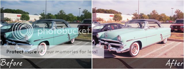
Step 1 - Preparing the image:

Step 2 - Adjusting Color Balance:

Step 3 - Solid Color Layers:
Note: If you want a more vibrant vintage image leave out the teal solid layer for something like this:

Other Site Examples:
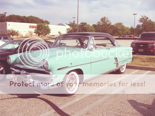
 Picnik, used temperature (under colors) for color balance and effects (under create) - tint, 1960s (there's also vintage camera style effects like Lomo and Holga!)
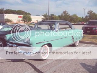 Pixlr, used brightness/contrast, hue/saturation for color balance, and solid color layers.
This concludes part one of this three-series post. Tomorrow we will work on the advanced methods such as using curves and selective colors to achieve the vintage look. In the third part of the series I will show you how to do some extra effects, like a vignette, to add little vintage touches to your images.
I'd love to see what you come up with!
No comments:
Post a Comment